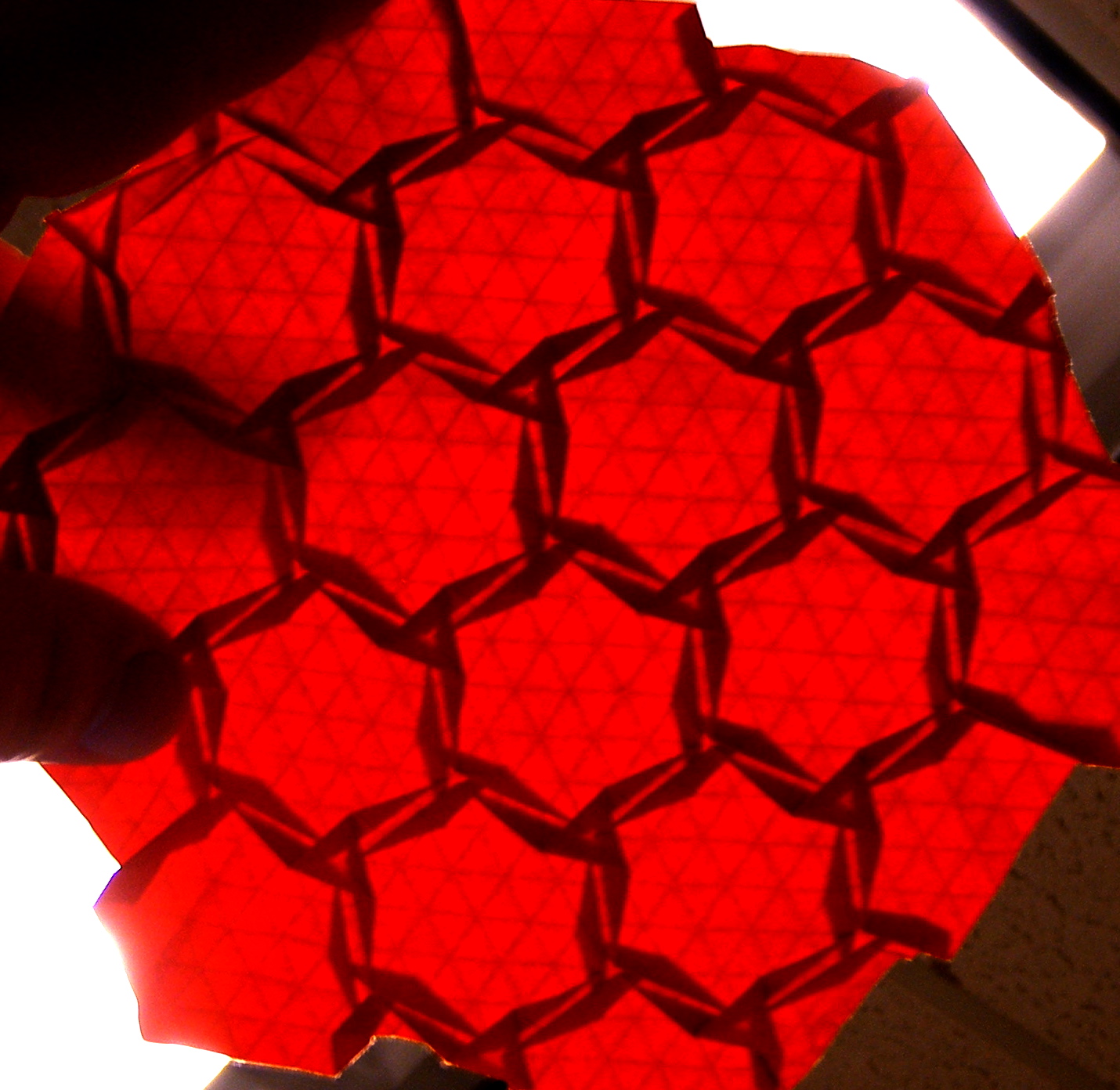
This tessellation is quite fascinating, for several reasons, which I hope I can elucidate here.
First, here’s the underlying tessellation- a 3.4.6.4 semiregular tessellation. (Image used from Totally Tessellated, which is a site well worth visiting if you like tessellations.)

Normally (for me, anyhow) folding a 3.4.6.4 tessellation requires using quite a bit of paper to flesh out all the pleats, intersections, and other parts; so necessarily, one must use a piece of precreased paper with quite a few division in it to really do the pattern justice.
The real beauty of the way this design has been folded lies in the use of elements on both sides of the paper; so the pleats coming away from the open-backed offset hexagonal twists on the back turn into the pleats leading into the triangular twists on the front, with a minimum of wasted space.
Joel Cooper uses this technique very often, in his “flagstone” style tessellation patterns. While this design does not pack the twisted polygons as close together as Joel prefers, it still uses the same types of concepts- putting the twist elements on both sides of the paper, and using the interconnecting pleats as a sort of “middle layer” to do more work with less paper waste. This is a somewhat difficult concept to execute in paper form, at times, so I am very pleased to see more people picking up on the idea and running with it like this.
I’m also quite enamored with this pattern because of the use of spacing. It’s not a big secret that I’m particularly fond of open patterns that let a lot of light through them- it’s not just because I’m lazy and like to avoid close, dense packing of patterns (although that’s quite true!) but I really enjoy a good balance between light and dark, shadows and brightness. By using these multiple layers (or at least conceptually, multiple layers) the pattern has a much richer depth to share with us when it is backlit. Besides the 3.4.6.4 tiling, the twists, and the overall circular feel to it, we also get wonderful bowtie patterns linking all the sections together, as well as quite a few different areas of paper thickness- which, especially if folded from a light paper like white unryu, would really make a striking difference in shading.
This is a great design, and I’m really rather smitten with it! Good work!
I highly encourage you to check out additional work by Miguel, on Flickr or on his wonderful blog, Doblando Papeles.


